Posts

Showing posts from November, 2022

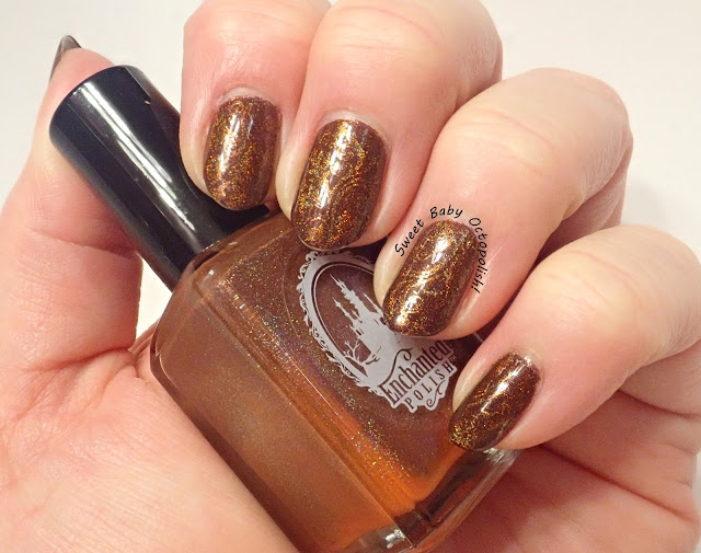
Enchanted Polish February 2017

Image
Continuing both my light & dark alternating manis and my deep dive into Enchanted untrieds in my stash, I pulled out one that I neglected for years.  It's funny how much your "mood" can play into whether a polish works for you or not. When I originally bought Enchanted's February 2017 mystery, I was pretty ho-hum about it, just another pastel holo.  I was wrong. indoor, bright CF lighting The 2017 mysteries were all "remixes" of early, hard-to-find colors, with this one being an updated version of Lucy In The Sky With Diamonds.  The rarity and gotta-have-it-ness of the original (other nail blogs showed direct comparisons between this and the original as being extremely close) was frankly the only reason I kept this one, since I didn't think at the time it was something I'd necessarily love.   indoor, bright CF lighting Again, seriously y'all, I was wrong.  Feb 2017 is a desaturated, nearly white linear holo.  It's a little sheer on the fi

Enchanted Polish Hot Chocolate For Unicorns

Image
I'd originally intended to stamp my last mani with some fall leaves, but that color was just too distracting to cover up.  Then last week, I received from older Enchanted Polishes from an estate sale, which reminded me of how much I loved their stuff, so take 2 for fall leaves: indoor, bright CF lighting Hooboy, pulling this one out of the vault!  Enchanted Polish released Hot Chocolate for Unicorns way back in 2014.  As you can see here, my bottle has a pretty fantastic case of "ugly bottle syndrome" where the chalky white pigment that makes the polish opaque (and not a sheer jelly) has started to precipitate out onto the bottom of the bottle.  It looks orange here, but nah, it's actually white. window-filtered bright daylight Hot Chocolate is an utterly perfect shade of melted Hershey bar.  It's super smooth and creamy, and is a one-coater if you have a heavy hand.  I found that a 2nd coat deepened the color, though it had no real effect on opacity.  That rich o

a England Flaming June

Image
I've been feeling the fall vibes lately, with crunchy leaves all around and the drop in temperature, and an ad for a England's latest collection reminded me I had a perfect fall polish waiting in the wings. indoor, bright CF lighting Flaming June is named for the iconic Leighton painting of a sleeping woman decked in a gauzy orange dress.  The color is a perfect match for the fabric in that image, a warm coppery metallic orange.  Even though orange is firmly not my jam, I absolutely had to have this the moment I saw it.  outdoor, bright direct sunlight That sale ad for the new collection somehow led me down a rabbit hole of looking at the rest of the polishes in this collection, Leighton's Nymphs, and other than the polish named for Leighton himself, the rest have this soft green contrasting shimmer.  I'm convinced that it's here in Flaming June also, making the metallic flash in the center a cooler tone than the warm orange of the base. indoor, bright CF lighting I

Bee's Knees Gravebone

Image
Well, for the duration of Halloween I kind of ditched my alternating light & dark mani looks, but in thinking I should get back to that (and also reminded of all the gorgeous things I have untried by Bee's Knees recent release), I picked up Gravebone. indoor, bright CF lighting Gravebone is one of those extremely accurately named polishes - it's a jelly somewhere between nude and taupe, rather like old, weathered bone, dusted with a sprinkling of aqua-to-purple shifty shimmer. outdoor, bright afternoon daylight It's quite sheer to let that shimmer shine through, though I don't think it'd work as a topper because of the highly unusual base color.  Though some of BK's other "UP" polishes were sold with opaque crème undies, Gravebone was not.  I'm showing 3 coats here, and have even coverage but not opacity. outdoor, bright afternoon daylight In angled lighting, the sparks of unearthly sea green flip over to blue and lavender purple, which pulls t

Lemming Lacquer Hunger

Image
Leaping back to a saturated color, when the man suggested green I picked out this aurora-bomb of color. indoor, bright CF lighting for all photos Utterly delicious.  Lemming Lacquer released Hunger as part of a series dedicated to Florence + The Machine, and this one is inspired by the album cover for Lungs, and I think it's a fantastic match. Hunger is a very teal-leaning saturated green with a fine scattered holo shimmer and loaded in warm ruby to copper aurora shimmer This went on in two smooth coats, and I had no troubles with the brush or formula.  I have to say I'm a fan of these big chunky square bottles - yeah, they take up more room on the shelf, but they feel so sturdy and they're pretty impossible to knock over on your table. In angled lighting, the shimmer shifts over to a deep emerald and completely masks the teal leanings of the base color.  It's a lovely effect that blazes just gloriously in sunlight... but between the dreary weather we're having late

Lacquester Mortal Coil

Image
 One of my fave brands had an absolutely stunning deep blue with rainbowy aurora shimmer, and before I clicked "buy" I thought wait a sec, where have I seen that before... indoor, bright CF lighting for all photos Aaaaaah, yes, that's it.  In yet another example of "stunning things I've left untried for literally years" we have the amazing Mortal Coil, which Laquester released way back in 2017.  I was stunningly in love with the green version, which I wore nearly immediately on arrival , yet somehow never got around to the OG stunner.   This is a very slightly dusty navy blue, lightly dusted with holographic microglitters and filled to the brim with a gorgeous aurora shimmer that shifts red to bronze to green.  My nails were always multiple colors at once and the little holo sparks shone out like stars in a night sky. lookit that shift! This polish is staggeringly beautiful in bright sunlight... of which we had absolutely none after the first day I wore it. 

Halloween 2022 - KB Shimmer Pump It Up Pumpkins

Image
One more Halloween look, but for the last round I skipped on glow and went with glam. indoor, bright CF lighting for both Pump It Up! was KBShimmer's offering for this past month's PPU, and as soon as it arrived I knew I was going to get one last Halloween mani in with it before the end of the month.  This is a really wearable orange (I typically do not like orange at all), more warm caramel than neon ORANGE.  It's a smooth jelly base with tons of reflective glitter that I'll swear is a bit holo, too, and provided complete coverage in 2 coats. On top of PIU! I've added pumpkin images from Creative Shop 16S and Dixie Plates Halloween 2017 in basic black.  I filled in the big pumpkin stems with OPI Landscape Artist, which was more opaque than I remembered/wanted, but hey it worked out. Rating:  a sparkly 4 out of 5 stars, this does exactly what I wanted it to, and removal was nowhere near as awful as I expect for glitter-heavy polishes.   Where to buy:  while PPU is o