Posts

Showing posts with the label the vault

Wet N Wild Morbid

Image
Alrighty y'all, it's time for ALL HALLOWEEN ALL MONTH WOOOOOOOOOO First up, I'm going to start with probably the most Halloween-y named polish in my stash, Wet N Wild Morbid. indoor, CF lighting Morbid is absolutely perfectly named - it's the color scheme for every movie poster about vampires and werewolves going bump in the night, where it's not just black & white, it's murky teal and dirty charcoal. ya know what I mean? And this polish is only a hair older than that movie poster color scheme, being released as part of the "craze" line in ~2009.   bright afternoon daylight Morbid is an off-black base, slightly brownish-tinted and not a true neutral charcoal, giving it a "dirty" grungy look.  It's jam-packed with a borderline metallic deep teal shimmer that's fairly subtle in low light but blazes beautifully in brighter lighting. outdoor, bright direct daylight The brush and bottle are kinda weird to work with, since the bottle ca...

Jessica Street Swagger + Ethereal The Dark Mark

Image
Halloween is over, but I'm apparently not done with being vampy & mysterious...  indoor, CF lighting This mani started with 2 layers of Jessica Street Swagger, a deep, every so slightly brick-leaning, truly dried-blood red crelly.  The last time I wore this , I got away with a single coat, but this time around I painted much thinner layers and needed more like one-and-a-half.  It's still got a dead perfect formula that dries to a very nice shine on its own - it's polishes like this that teach me why there are folks that choose to wear unadorned crèmes and crellies on the regular.   outdoor, afternoon daylight Punching up my plain red, I've added a single heavy layer of Ethereal The Dark Mark, a very dense aurora shimmer topper in a barely grey base.  The end result is a sexy blackened scarlet with subtle shine and shimmer indoors, that explodes into color-shifting fire when I stepped out into the sun.   outdoor, bright afternoon daylight Becau...

Birding weekend: CQ2 duochrome 253

Image
 I ran away to Cape May NJ this past weekend to go check out the amazing variety of birds migrating through this time of year, so my nails of course needed to match. indoor, CF lighting I'm reaching way back into the vault here - I think I bought this polish back in the 90s.  The brand name is CQ2, and I'm not sure I've ever seen it before or since, with the only name being the number 253 on the back.  It's a pearlescent chromed-out warm gold-to-cool pink duochrome that needed 3 thin coats to get to the opacity you see here.  It's definitely from the days before 5-free, with the distinct paint aroma and slightly thin formula.  I've topped it with a cute birds perched along a wire image from Nicole Diary L-10. American Oystercatchers flying over the sound The birds were occupying my camera, so I didn't get many pics of this nail art look, but I had a wonderful time! ~Michelle 

OPI Planks a Lot

Image
 I needed a light lavender/purple base for this week's book club nails project, and decided to wear this oldie from the vault by itself for a  couple days first.  indoor, bright CF lighting OPI released Planks a Lot with their 2011 Pirates of the Caribbean collection, which was all pastel crèmes without a swashbuckling piratical color to be found.  outdoor, bright direct sunlight Sadly, these crèmes are kind of a pain to work with - I thought so when I first got the couple of them I have, and now that I'm loads more confident with polish application, I still think these are pretty imperfect.  The formula is simultaneously a little too watery and also a little too thick, and if you overwork any one spot you'll end up with balding.  Blah.  outdoor, bright direct sunlight Rating:  3 out of 5 stars.  It's a really pretty color that's quite unique in my stash, and it did wear rather well... but this formula isn't for the faint of heart.  Wher...

Star Trek TNG: All the Redshirts

Image
Closing out my Star Trek series, I have to make a nod to all the boys wearing command red.  Q is of course my fave, especially in his completely over-the-top judge's robes from the very first episode, so this design has as much black in it as red. indoor, bright CF lighting Baroness X has been releasing some amazingly pretty fluid art polishes - instead of simple crème finishes, she's adding shimmer or flakies, and for X Marks the Spot she's added a handful of holo dust. outdoor, overcast daylight To get this look, I started with a layer of Julep Karmen, a fiery red foil that's been used several times in nail art experiments, painted thickly across a silicone mat.  I then added drips of OPI Glamour Game, a somewhat sheer champagne gold shimmer, and drips of X Marks the Spot.  When I had a big enough pool to work with, I folded the mat in half a couple of times, and tilted the mat on it's side to get the paint to flow and spread out. outdoor, overcast/shady daylight ...

Bees & Honeycomb

Image
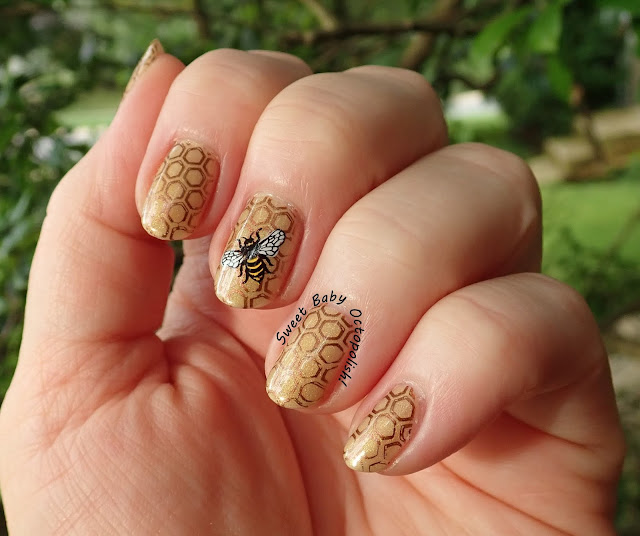
When I was thinking out loud about what color I wanted to use for my next mani, the man came up with a very elaborate plan involving multiple colors to represent sky, grass, and plants, with a bee flying in between them.  "Bees!" I said, "I can work with that." outdoor, shade I started with a base of the same sparkly white crelly that underlied my July 4th design, then added 2 layers of a very old TOMA thermal that's died in a soft honey-gold shade.  It's quite sheer at this point, with just a suggestion of shimmer, but was utterly perfect for this look.  Hot tip from a nail fiend with too much polish: dead thermals and stuff with crappy formulas work great for nail art experiments! outdoor, shade Next, all nails got a honeycomb design from BM-422 in Hit The Bottle Espresso Martini.  My accent nails are the utterly perfect bee design from BM-S241, an Edgar Allen Poe themed Halloween Plate, stamped in black and filled in on the stamper, then place...

ILNP Birefringence

Image
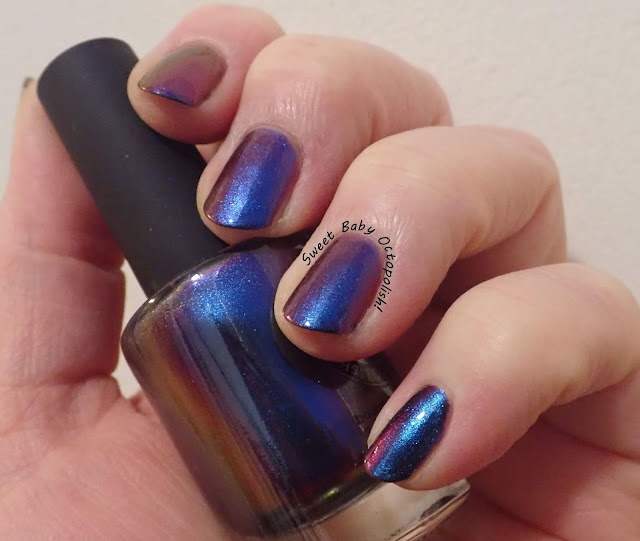
The other polish that I immediately thought of when deciding what to revisit was one that I always find myself shocked that I somehow never photographed.  I just know I've worn it at least twice before this, but maybe I'm just imagining things... indoor, CF lighting Once upon a time, Ozotic made duo-and  multichrome polishes that had really pretty shift (according to pics, I don't actually have these myself) but were so sheer that wearing over black was a definite necessity.  Then ILNP burst onto the scene, first with some pretty holos, then with some staggeringly beautiful shifting magic that was opaque on its own, no undies required.  ILNP Birefringence is the absolute mother of all multichromes.  I had a hard time narrowing down all the pics I got, so buckle up, and spoiler alert - all the colors even hinted at in that bottle shot above are absolutely visible on the nail. outdoor, shady and overcast daylight When viewed dead-on, Birefringence is a...

Butter London Two Fingered Salute

Image
The very first  polish that came to mind when I decided I was going to revisit older things I'd never blogged/photographed before was Butter London Two Fingered Salute.  I swooned over this when The PolishAholic (sweet baby octopus I miss her blog and perfect pics!!) said it was an all-time fave, and yet it was distinctly underwhelming on me.  Definitely time for a reload! indoor, bright CF lighting Two Fingered Salute, an exclusive for Nordstrom from way back in 2012, is an earthy crelly somewhere between aqua and green, utterly jam packed full of shimmering copper microflake. outdoor, direct sunlight The microflake flashes between metallic copper and metallic pink - I never could decide if it was duochromatic or if there were two different types of shimmer, but it's a fun effect regardless.  If this was a more saturated aqua color in this shade, I'd end up with lobster hands for sure, but the earthy mutedness that makes this look dead-on for copper verd...

Enchanted Polish Winter + ILNP Absolute Zero

Image
This week is cold and snowy AF, so while winter designs are thematically appropriate this time of the year, I'm kinda suffering and can't reasonably reach for snowflake stamping plates and stuff like that.  When searching through my spreadsheet for other worn but not photographed/blogged polishes for this here reload series, though, I did find the most impossibly appropriately named pair ever. indoor, CF lighting ILNP released Absolute Zero as a gift with purchase if you bought a certain number of their 2013 Fall collection polishes, and Winter was from a 2016 winter trio, and those are the frostiest polish names I have bar none. window-filtered bright afternoon sunlight Winter is a slightly greyed white - the closest I have in my stash to a "true" white linear holographic, this phenomenon being notoriously difficult for makers to achieve since holo pigment is itself grey.  Ultimately, I feel that stark whites have an unfortunate resemblance to whiteout, w...

a England Saint George + Princess Sabra

Image
A serious fave of mine, a England Saint George didn't get to shine boldly in my last mani, and while it was out on my table I decided it very much deserved it's own moment.  I've paired it with another aE scattered holo gem, Princess Sabra. indoor, bright CF lighting Saint George is a very deep, super saturated teal that leans just a hair more to the green side than the blue.  Princess Sabra (aka Tristam Eyes, named for the maker's cat) is a warm, antique gold.  Both have that gorgeously unique aE scattered holo finish that's not at all greyed out in lower lighting, but shimmers with a rainbow sheen in bright sunlight. window-filtered bright afternoon sunlight outdoor, bright winter sunlight Princess Sabra absolutely needs the two coats shown here to get the depth of the color in the bottle.  Saint George is fine in one somewhat thicker coat, though I'm wearing two here.  Both have utterly perfect formulas and utterly perfect brushes that m...