Posts

Showing posts with the label flakie

Femme Fatale Malachite

Image
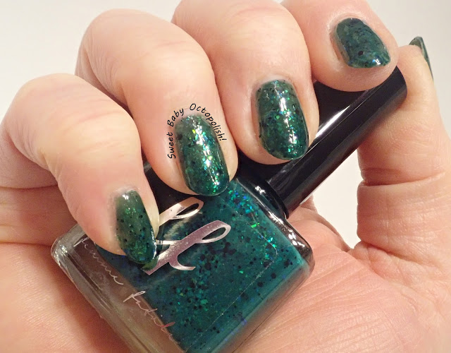
For my last polish for Femme Fatale February, I'd been growing out my nails a bit to show off a thermal polish to best effect... and then a major cleaning project at home resulted in several chips & breaks on my swatching hand, so for this post Cindy takes the spotlight. indoor, bright CF lighting Thermals are notorious for having a finite shelf life, typically guaranteed to be working well for 6 months.  Malachite, released as a color of the month in November 2021 is my oldest untried thermal from Femme Fatale, and it's still working perfectly fine 15 months later. indoor, bright CF lighting Between the awkwardness of shooting the camera with my left hand, and the notorious trickiness of accurate color capture of teals, I find the bottle look to not be completely accurate, though the color on my nails certainly is.  Malachite is a very well-named polish, a bright earthy green when warm (above) and a deep emerald forest when cold (below), packed with "ocean flakies...

Pahlish Sleep to Dream + Goldsmith

Image
For the past couple years, I've decided on a theme for my nail looks - first it was colorful alternating with neutral, then light alternating with dark last year.  By some small miracle, a long-searched for DISO fell into my lap this week, which caused me to pore through all the far too long unloved polishes in my stash.  BAM!  This is the theme for 2023:  I'll pick a new brand each month, and select from the oldest yet-untrieds I have of that brand.  In shopping my stash, I'll either feel the need to purge or I'll dig up buried treasure! indoor, bright CF lighting for all photos Hooooboy I have been collecting and wearing polish for more than a decade, with some things lying untried for longer than the brand was in business, eek!  Pahlish is thankfully still going strong, and still with really personal and unique inspo for her collections.  Today I'm showing Sleep To Dream, from her 2013 Winter collection.  The name is taken from a Fiona Apple so...

Pahlish Wild Rushes

Image
For a couple of years, Pahlish has been using some absolutely lovely crushed gold flake in an offering here and there in one of her collections, and after loving the first one I tried I've been scooping up the colors that appeal to me. indoor, bright CF lighting for both Wild Rushes is a faded khaki green, a very organic and soft color, filled with these lovely gold flakes.  Like the others of this type I have, the base is fairly sheer so the flakies don't get swamped, and I'm showing 3 coats to opacity here.  Work and life and stuff have all been super crazy, so I somehow failed to take adequate photos of this - just a quick review here. Rating:  3 out of 5 stars.  Somehow, this one just didn't work for me.  The green was more faded/greyed IRL (these photos ironically look slightly more saturated, like how I expected the polish to be from the sales swatches), and it wore very quickly.  Still very much worth giving another try when I'm in the mood because i...

KBShimmer Ready For This Jelly + Moumantai Comparison

Image
A fave brand's upcoming collection includes an utterly gorgeous, rich, deep violet, jam-packed with "ocean" flakies, and I just have to... wait a sec, I'm sure I've bought this before... indoor, bright CF lighting KB shimmer released the gorgeous Ready For This Jelly as an exclusive for PolishCon 2016.  It's a deep, saturated, bottom-of-the-sea violet packed with the "ocean" type iridescent flakies that shift aqua to blue to green.  outdoor, shady/overcast daylight This polish went on like a dream in 3 perfectly smooth coats, giving me zero problems with the brush or formula.   indoor, bright CF lighting Interestingly enough, this polish starts out purple and very sheer on the first coat, yet somehow builds to looking violet and if anything leans slightly more blue than purple.  I've no idea how it leans cooler-toned with each coat, but the end result is stunning and looks just as vibrant as the bottle.  outdoor, shady/overcast daylight If the lu...

Dreamland The King & The Queen

Image
 While I was ready to switch back to a lighter shade, I wasn't entirely ready to let go of green, and yet didn't just want a pale version of my last look... indoor, bright CF lighting Dreamland Lacquer released The King & The Queen as their offering for the August 2019 "At the Carnival" themed PPU. outdoor, shady/overcast daylight King & Queen has a soft grey crelly base that leans ever so slightly verdigris, like the palest edge to an old, worn dollar bill.  It's packed with iridescent flakes that flash from pink to gold to green. indoor, bright CF lighting The flakie density makes this polish just a bit thicker than I prefer, getting instantly sticky on application such that getting up to the sides of the nail smoothly and wrapping the free edge is tricky.  And yet, it wore like iron, with no chipping or visible edgewear after several days, so a well-performing formula anyway. outdoor, shady/overcast daylight I'd meant to use this as a base for a sta...

Tonic Polish I Had the Times Square of My Life

Image
 This week's light polish (that theme has worked for a whole 3 weeks haha!) is a super bright silver. indoor, bright CF lighting Tonic released I Had the Times Square of My Life way back in 2017 as a store exclusive for Color 4 Nails, and I'd originally passed on it because it was sold as a duo with a red polish that wasn't my jam.  I managed to snag a bottle when Tonic cleared out the vault and it is indeed super sparkly! outdoor, shaded daylight Times Square is a sheer, light silver base filled with both holo dust and holo glitter, and a bunch of metallic multichrome flakies.   outdoor, bright afternoon sunlight Turns out it also has a surprise flame of metallic contrast shimmer that shifts a bit from pale gold to warm copper, which catches and reflects any bright light shining on it. indoor, bright CF lighting Though I can see a bit of VNL in some of these photos, that wasn't the case IRL - Times Square was nicely visually opaque in just 2 smooth easy coats. ...

Cuticula Dragon Glass

Image
Wanting something a little more low-key for this New Year's Eve, skipping out on a look stamped with celebration, I picked something that would have the fireworks embedded within. indoor, bright CF lighting Dragon Glass was Cuticula's offering in the August '21 "elements" PPU.  It's a black jelly packed with iridescent jewel-toned flakies, giving a very 'black opal' look. bright daylight To let those flakies shine brightly out of such a darkly colored base, this polish is sheer - much more so than I was expecting, in fact.  I have plenty of other flakie polishes with richly saturated bases, so it didn't occur to me that using it as a topper was the way to go, and I'm showing 3 and a half coats here. indoor, bright CF lighting In bright lighting indoors or out, the sheerness overlying my skin tone meant that this polish looked charcoal-grey or a warm-leaning off-black rather than true deep dark BLACK black. outdoor, shaded daylight In low light,...

Book Club Nails - Harry's Trees

Image
Sometimes when I do themed nails for book club, the design is inspired by the text, while other times the simple graphic design of the cover demands to be re-created - this month's book was firmly in the latter category. indoor, bright CF lighting for all The cover of Harry's Trees by Jon Cohen features a barely turquoise blue background graced with a golden leaf, and little gold coins (gold coins being a plot point in this Hallmark movie of a book): An old dead thermal with just a hint of shimmer was just ideal for the base color here.  The gold leaf is from KADS Nature 036, using El Corazon Fragrant Mimosa for that bright metallic gold flash.  Pahlish Goldsmith - a topper version of their fantastic crushed gold flake polishes - provided the perfect dusting of little gold coins in just one light coat.   While I wasn't a real fan of the book, I did love this nail art look and wore it happily all week.  Goldsmith is a real winner, and should probably be in heavie...

Shleee Forgotten Things

Image
 I reached for a metallic color this week, and after looking through the bins of silver and gold, spotted just what I wanted in the copper section. indoor, bright CF lighting Shleee Polish continues to be one of the absolute queens of shimmery goodness.   outdoor, afternoon daylight Forgotten Things starts with a super sheer, barely smoke-tinted base.  It took 3 thin coats to build up to opacity, so it would very easily serve as a topper - this would look smashing over any shade of grey all the way through to black, or a very dark red. indoor, bright CF lighting In direct light, Forgotten Things is a beautiful, rich copper.  It quickly shifts over to bronze at a slight angle - easily evident across just the curve of my nails - and hits a bright peridot green at longer angles.  Scattered across that is a really nice holo flake, whose silver vanishes into the metallic base in low light, then leaps into bright rainbows in bright light (below). outdoor, afterno...

Baroness X Molino

Image
 After some screaming acid green, it was time for a slightly more girly palate cleanser.  But I'm clinging to the end of summer, so no time for true neutrals! indoor, bright CF lighting Baroness X released her "Ex Libris" collection in 2015, and it still remains one of only a very tiny few collections I own all of.  Each of them is a brightly saturated jelly packed with Clarins 230-type pigment or one of its sisters, plus ultrachrome flakies.   outdoor, afternoon daylight Molino is the red of the collection, a berry-leaning red jelly filled with UP sister gold-to-green shimmer  and lightly sprinkled with chrome microflakies.   indoor, bright CF lighting Because it's a jelly, it needs to be built up a bit... which also means there's a lot of layering possibilities if that's your jam.  As per usual for polishes that look "complete" (as opposed to things which are obviously toppers in clear base), I prefer to do a couple more coats to get to wha...