Posts

Showing posts from January, 2020

Book Club Nails: Educated

Image
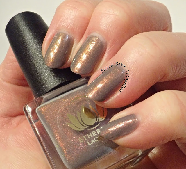
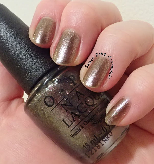
Nail art inspired by the book is absolutely a thing for me now with my book clubs (because yes, I'm such a huge book nerd I have not one but TWO book clubs).  I'm having loads of fun seeing what stamping plates I can layer & combine to bring out a theme, and I'm revisiting a lot in my stash doing these. My inspiration comes straight from the punchy graphic on the book cover of Educated, by Tara Westover: copyright of course to Random House The rough-hewn pencil containing the image of mountains is instantly recognizable and evocative of what's in the pages within - an A+ job by cover artist Patrik Svensson.  Since the image of the woman climbing the mountains would be beyond tiny on a single fingernail, I decided to split out the two elements to pencil and mountain. I started with my existing mani of SOPI Frankly I Don't Give A-dam + Ethereal Lacquer Grímnismál, since the smoky grey felt like it matched the book's tone.  The inexpensive wo

Ethereal Lacquer Grímnismál

Image
I'm on a HHC/PPU kick lately, apparently itchy to see how all these LE one-and-done polishes stack up in reality to the glory of their inspirations.  This time, I actually did switch over to a neutral color... indoor, bright CF lighting Ethereal Lacquer seems to be making her brand name into her esthetic, releasing a slew of delicately ethereal sheer polishes glowing with fiery shimmer.  In the bottle, Grímnismál from the January 2019 mythology-inspired PPU fits right in with these, full of color-shifting shimmer. outdoor, overcast daylight Assuming this one was super sheer, I started with one coat of Sephora OPI Frankly I Don't Give A-dam, which is nearly a one-coater itself (having thickened up slightly from when I got it new).  It's a true mid-tone grey, leaning neither blue nor brownish, and to my eyes was 100% dead on for Grímnismál's base color as visible around the corners of the bottle. indoor, CF lighting The aurora shimmer leaps out of this o

Delush Polish Slice of Life

Image
One good thermal deserves another, of course, and this one fit in with my plan to alternate between traditional and non-traditional colors (yeah, right, this is nowhere near "neutral"). indoor, bright CF lighting Delush Polish is known for their glitterbombs - big circles and chunky shapes in tinted bases that somehow manage to look put together and elegant instead of like a confetti party.  This is my first bottle from them, and in addition to the trademark glitters, this one is a red-to-wine thermal. window-filtered bright sunlight Slice of Life was a subtle thermal in the swatch photos floating around PPU back in October 2018 - this one is from the Villains theme month, and is inspired by Dexter.  I don't know if my bottle has died in an in-between zone or if this is just how it's always been, but I could discern no thermal shift at all.  outdoor, bright sunlight Instead of a funky french tip change effect, Slice of Life seemed to have a subtle du

Femme Fatale Winter Fire

Image
This winter has been really odd, swinging from freezing to springlike every week or so.  With the merely cool but not frosty temperatures outside, plus a decent length on my nails right now, it's thermal weather for sure! indoor, CF lighting Winter Fire is part of Femme Fatale's recent Stephen King inspired series for HHC.  It's thoroughly unusual, and I have nothing even close in my stash. indoor, bright CF lighitng When this thermal is warm, it's a bright tomato/poppy orange-tinted red that would not be my usual go-to.  When cool, it's a deep slate/teal blue.  The swings this thermal takes are quite dramatic. indoor, bright CF lighting I've had only a few other thermals with such a vast gulf of difference between the warm and cool states, and typically I don't like them, because the in-between colors look muddy.  Somehow, though, the iridescent microglitters and flakies in this concoction keep everything tied together at all times, and it

OPI The World is Not Enough

Image
A couple of years ago, I swatched polishes for a while alternating between fun flashy things and neutral colors.  The experiment didn't last for the whole year, but I certainly did get around to trying out more of my browns and golds and nude colors, so I'm going to give that a whirl again this year.  We'll see how long it lasts, but a good palate cleanser reminds me of why I grabbed all these pretty but more office appropriate shades in the first place. indoor, CF lighting One of OPI's all time best ever holiday collections was the 2012 James Bond-themed Skyfall set. Yeah, the obligatory reds made their appearance as required for an OPI holiday shindig, but there were plenty of really lovely and unusual things that arrived alongside them.  A few of them, including On Her Majesty's Secret Service contained this lovely pink/green/golden shifty glass fleck shimmer.  This one is The World is Not Enough, OHMSS's bronze-taupe sister. indoor, bright CF ligh

Comparison: Starlight Polish Unicorn Tears, Bee's Knees Concilium, Femme Fatale Maleficent

Image
Starlight Polish Unicorn Tears was absolutely lovely...and when I leave lovely things untried for so long, there's always a good chance something similar has caught my eye in the time between purchasing and wearing it. indoor, bright CF lighting The beautiful green shimmer in a vampy purple base is an eye-catching enough combo that I've definitely magpied similar things before.  To compare with Starlight Polish Unicorn Tears, I've pulled the recently released Bee's Knees Concilium and Femme Fatale Maleficent. indoor, bright CF lighting In the bottle, Unicorn Tears and Concilium look quite similar, with shimmer particles bordering on glass-fleck sparkly in jelly bases.  Maleficent is distinctly different here, with the glowy green being a much more finely milled texture. indoor, bright CF lighting At an angle, another difference pops out right away - the shimmer in Maleficent tilts over to a bright pinkish magenta rather than the aqua and cobalt blue of

Starlight Polish Unicorn Tears

Image
The holidays being behind us doesn't mean festive stuff has to get put away, and for some reason I was reminded of a lovely purple that had languished for a good while on Mount Untried... indoor, bright CF lighting Starlight Polish released Unicorn Tears as part of her original trio of mythological beast-themed shimmery polishes.  Though her toppers later became the big draw, all 3 of these are really beautiful and well worth looking into! outdoor, overcast daylight Unicorn Tears is a sheer, dusty blue-based purple jelly base liberally filled with a green-to-blue "UP sister" shimmer - note that she named these polishes several years before calling the magic stuff in clarins 230 "unicorn pee" was a thing, so in her store everything labeled Unicorn is this particle.  outdoor, overcast daylight This shimmer starts as a saturated emerald in direct lighting, only very slightly blue-leaning (the bottle shot up top captures that best).  Once you start

New Year's Eve: Bee's Knees Who The Hell is Bucky?

Image
Time to ring in the new year! outdoor, bright direct sunlight for all photos Bee's Knees keeps coming up with fantastic themed mystery bag polishes that are later sold individually if mysteries aren't your thing.  Out of each of these releases, there's at least a few that I just have to grab.  Who the Hell is Bucky?, a part of the Marvel mysteries, is a not-quite-black charcoal base packed with dark red aurora shimmer and a sprinkling of holo flake.  Vampy and glowy, it's ideal for a late night party look. I started with one coat of Bucky on each nail, then made marble decals for my thumb, index, and pinky with Dance Legend Spot It White, Sinful Colors Under 18, and Zoya Alicia along with Bucky.  My Spot It appears to not really be working anymore, but while I didn't get many areas with good foam cells, the marble effect was still very pretty. Festive designs on each hand are 2 perfect coats of Bucky, stamped in Emily de Molly silver holo, using imag