Posts

Showing posts from September, 2016

Tonic Huckleberry Sparkle

Image
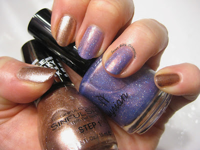
A major lemming for every purple polish lover that doesn't have it is Cirque's Coronation, and I am certainly no exception.  One day, I should line up all the purples I've bought to try and put this lemming to bed.  One of the more recent contenders is Tonic's Huckleberry Sparkle. indoor, bright CF lighting Tonic blew onto the indie polish scene a few months ago with an incredibly well put-together inaugural collection, including this luscious purple crelly.  Huckleberry is sprinkled with little holo microglitters, and overlaid with a gorgeous coppery contrasting shimmer. outdoor, late afternoon daylight Look at that glow, YASSSSSSSSS. outdoor, shady daylight HS is a bit thicker than ideal (I'll likely be thinning just a smidge before wearing again), a little sticky in the way that overworking one spot drags it up a bit, and is opaque in 2 coats.  It's the kind of devastating color that gets you compliments from strangers at stores.

Quick comparison: Sinful Colors Kreme de la Kreme VS Cirque Halcyon

Image
The moment I found Kreme de la Kreme, confirmed by the moment I put it on, I knew comparing it to the sold-out and sought-after Cirque Halcyon was necessary.  Turns out they're not exact dupes, but Kreme might help a whole lot if you're pining for Halcyon.  For all pics below, Halcyon is on the right. indoor, bright CF lighting indoor, less intense CF lighting from more diffuse source First things first:  the color isn't identical in these 2, with Halcyon being a little more rosy, though both look ROSE gold and not simply gold when worn. The shimmer particles are the major difference, with Halcyon being made up of metallic microflakes and Kreme a much finer metallic shimmer.  Halcyon gets the advantage here, with a blinding hammered-metal shine in the sun. Kreme de la Kreme is completely opaque in one coat, while Halcyon needs 2, giving Kreme the advantage in nail art if layering thickness is of concern. They're genuinely close enough that I d

Topcoat battle! HK Girl VS Pro-FX quick dry!

Image
I'm sure that every polish geek has a half a handful (or plenty more) topcoats - I myself have my go-to quick dry, a thicker one for chunky or unsmooth finishes, some back-up "lesser" quick drys, and a matte.  Having that many, though, honestly means we're all still looking for MORE! For a couple of years now, my holy grail TC has been HK Girl.  I'd been pretty happy with INM Out the Door for a year or so, but HKG dries much faster to a harder (aka more chip-resistant) finish, so I made that switch around the time we started blogging here.  I've never had the love affair with Seche that plenty do - it seems more stinky to me and I get shrinkage often enough to have never bought more after my first 99 cent mini of it.  I've seen a few blog posts mentioned some behemoth from WalMart, and remembered to pick up a bottle when driven to the commercial den of iniquity by a wild goose chase for multichrome notebooks, which brings us to... Topcoat Battle!!!!

Sinful Colors Kreme de la Kreme + Illyrian Awaken Your Magic

Image
Illyrian is blowing things up lately, and several of the shiny new things that just arrived at my house immediately clamored to jump to the head of the queue.  The gorgeous copper shimmer in Awaken Your Magic just happened to match the metallic rose gold of another new arrival, Sinful Colors Kreme de la Kreme, so the 2 got paired up tout suite. indoor, bright CF lighting Awaken Your Magic is a sheer lavender jelly with a rich coppery contrasting shimmer overlay and a sprinkling of silver holo microglitters.  It needed 3 coats for level of opacity seen here, which still shows some VNL, but in an even non-streaky way i'm fond of.  Each coat was perfectly self-leveling, so you could easily use this as a topper at one coat. indoor, bright CF lighting Kreme de la Kreme is an easy one coat wonder.  Though it's a bit thicker than ideal, that's likely to suspend all the metallic shimmer it's packed with.  Cleanup is rather tricky, since the shimmer dissolves into th

Sayuri HHC Pick Your Poison

Image
There's a whole lot of grey/pewter/black/charcoal untrieds lying around here, so I stuck with my 2nd black-with-a-twist for this week. indoor, bright CF lighting Pick Your Poison was an April offering of Hella Holo Customs from new-to-me Aussie brand Sayuri.   It's a mass of small aqua-to-purple duochromatic flakies in a dark charcoal base, along with a smattering of very fine silvery shimmer. outdoor, overcast daylight  The overall effect is subtly shifty in low light, then a charcoal with dark blue or aqua sparkle in bright light (oddly very similar to Morticia from earlier this week though the two really have nothing in common finish-wise). indoor, CF lighting Now, for all that this is a Hella holo, I gotta be real and say there's approximately no holo to be found here.  Yeah, in the macro you can see a couple of rainbow sparks, so there's some quantity of very fine holo dust in the mix, but it genuinely doesn't translate to the nail at all.

Ms Andry's Bath House Morticia

Image
I don't at all remember how I stumbled across the offerings of Ms Andry's Bath House, but in a world of hilarious nail polish names, she might win the whole internet (e.g., Bonerkiller, Aunt Flo, Feminist Killjoy).  Not so much abounds in the way of swatch pics of her stuff yet, but I had to check em out anyway. indoor, bright CF lighting Morticia is an inky near-black charcoal with a lovely cool slate-blue shimmer that makes it look like the iridescent flash off a raven's wing - approximately perfect for the namesake here. window-filtered overcast daylight Interestingly, though it actually IS a black polish, Morticia never looks plain black - that shimmer is present in all lighting other than the actual dark.  In bright light, the shimmer just gets more intense. outdoor, bright sunlight Rating:  3 out of 5 stars.  A fairly unique color in my stash, and so much more wearable than flat black, it's vampy without being completely goth.  The formula was a

Trust Fund Beauty Spring Detox & a quick comparison

Image
There's always time for a good duochrome, especially one forgotten in your stash for a while, so Trust Fund Beauty's Spring Detox stepped up when I went delving for a green - spoiler alert, huge winner. indoor, CF lighting When I first pulled Spring Detox out of the box and saw this emerald to pink shift, I was a little disappointed, thinking I'd yet again fallen for my e leventy-bajillionth iteration of the green to purple duochromes I apparently can't say no to . indoor, bright CF lighting But wait!  Both of these bottle shots are utterly accurate, and while Hey Jude-type duochromes sometimes get an almost mossy look, they never get this dirty swampy green.  Huzzah, totally different!! indoor, window-filtered daylight Spring Detox's base is a sheer swampy brownish-green that's packed with bright, nearly chrome emerald shimmer just a little finer than what I'd call a glass fleck.  I paint under pretty bright lights, and when my hand was di

Pahlish Saint Glinda

Image
Well, one good Pahlish for sure deserves another, especially with this big haul of Pahlish pretties looking right at me... indoor, bright CF lighting Saint Glinda is from Pahlish's recent Out of Oz collection, and was easily a must-have as soon as I saw swatch pics.  It was sheer but very self-leveling at one coat, and easily wearable that way if you like softer, more ethereal looks, but was nicely opaque in 2 smooth coats. window-filtered overcast daylight First off, it's loaded in fiery flakies that shift through all the colors of autumn - orange, copper, gold, purple.  Utterly gorgeous in shady/low light. overcast morning daylight Next, it's a bit shifty.  Note that both the warmer orchid pinky purple and the cooler lavender purple in these pics is color accurate.  I think that's mostly a question of which aspect of this polish is in the forefront at any given time (flakes vs holo vs base color), but I think we all know how much I love things that a

Pahlish The Man In Black

Image
Pahlish recently had a sale where purchases over $50 had this new LE, The Man in Black, tossed in for free.  You bet I found ways to spend that money right quick. indoor, CF lighting The Man in Black is a tribute to Johnny Cash (there's a Cash museum in the maker's hometown), done up as a black crelly with very tiny holo microglitter and slightly larger electric blue glitters. indoor, bright CF lighting The blue glitters were a little more apparent in the bottle than on the nail, but they did give a little flash of color even when the rainbow wasn't being flashy (i.e., in lower light).  The formula was great here, with 2 coats to total opacity, and a perfectly easy to control thickness to the almost-jelly consistency.  Cleanup was crazy easy, with no cuticle cling of of the black polish (what??) and no lingering sticky little glitters.  The only less than awesome thing about it was that the brush was very slightly wonky, the sort of thing that's fixed quickl

Tiger Nails with Color Club Cosmic Fate

Image
For a zoo event this week (wine!  animals!  fun times!!), I of course had to go with themed nails. indoor, bright CF lighting Color Club's Halo Hues collection was the best, right?  I mean, yeah, they are mostly lighter rather than rich dark colors, but damn if that holo flame is way more ultra than most polishes labeled "ultra-holo" and damn if that formula isn't thoroughly nice.  The brush is a little thin, but coverage is dead perfect in 2 coats, and the necessity for cleanup is utterly minimal. outdoor, partial sunlight Sorry no pics of this by itself, but swatches of Cosmic Fate and all her sisters are pretty easy to find.  This peachy copper was just orangey enough to look tiger-iffic for me while still very much suiting my skintone.  And of course Nanacoco Love Black + UberChic Out of Africa plate both performed exactly as well as they ever do. Rating:  Cosmic Fate is a near-perfect 4 out of 5 star polish. Where to buy:  aaaaaaall over the inter