Posts

Showing posts from May, 2017

BottleRock Napa 2017: Sinful Colors Kreme de la Kreme

Image
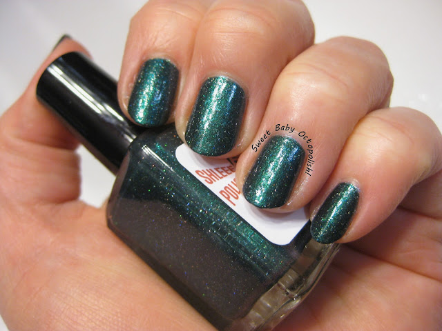
I'm having fun creating "event looks" lately - it's a nice change to actually play around with my stash instead of only swatching.  This past weekend, I spent a few days in the perfect weather of Napa California for 3 days of wine and music at BottleRock.  The line-up was fantastic, the company was great, there was literally wine for days... and I utterly forgot to take pics of my metallic nails gleaming in the west coast sunshine. indoor, with authentic wine bottle mani pic prop I wore Sinful Colors Kreme de la Kreme ( previously worn & reviewed here ) with arrows from the gorgeous new MoYou London Minimal 03 plate stamped in black.  As with other times I've used this polish, it's easy to work with and wears great - ideal for heading out of town for a few days when you have no plans to re-do nails partway through. ~Michelle

Alien Covenant: Shleee Nostromo

Image
I was off to see Alien Covenant this weekend, which neatly coincided with an Alien mani challenge on the Shleee Polish Facebook group, so my nails dressed up for the occasion. indoor, bright CF lighting Nostromo, named of course for the ship that found itself in trouble in the 1979 film, is a blackened teal shimmer sprinkled with holo flake that is utterly reminiscent of starlight gleaming on the sleeping ship .  Seriously, one of the best inspiration results ever!  It was mostly opaque in one coat, but deepened up and became flawlessly opaque with two.  The shimmer & holo flake have a tendency to stick to the skin, so careful painting that minimizes a need for cleanup is a good idea, but this polish did not stain my skin or cuticles at all. indoor, bright CF lighting For my fandom look, I added an accent nail with a pointed ellipse as a call-out to the glowing green line in both the Alien and Aliens posters, using Different Dimension Saber That, a neon green glow-in-th

Laurena Magnetic Red 01

Image
Quite a while ago, Suzy took me to a beauty supply store near her house that had a gargantuan nail polish selection.  There were several well-known brands, but lots of it was smaller (though not indie) brands we'd never heard of, and all of it was very, very affordable.  One of the unheard-of brands, Laurena, had a rack of magnetic polishes for just a couple bucks apiece that instantly called my name, and I grabbed this luscious red straight away.  I never stopped loving magnetic polish, and with the newer, more powerful neodymium magnets, they're back into trend again. indoor, CF lighting OMFG LOOK AT THAT.  Dying here. The bottle is labeled simply as "Magnetic Red 01" and my experience with this one makes me want to drive back to that store to snap up the rest.  This polish was very easy to work with, and had smooth, even coverage on the first coat - if you liked the color if it by itself, it'd be a one-coater.  MR01 initially goes on as a warm brick-ton

Femme Fatale Defiled in Gold

Image
As per usual when I'm feeling indecisive, the man picked a color for me.  As soon as he went for "metallic gold" (whaaaaa?  so unusual for him!), I grabbed the newest gold in my stash, Femme Fatale's Defiled in Gold. indoor, CF lighting Defiled in Gold is from the recent Neon Demon collection, based off the movie of the same name, and this polish is inspired by a pivotal scene in the middle that involves gold body paint in this exact shade.  It's a strange, atmospheric movie somewhere in between allegory and horror, and absolutely worth picking up if you dig flicks with a decidedly indie bent. outdoor, bright afternoon sunlight Wiping the brush back into the bottle, this seems to be a mahogany-tinted base that's jam packed with gold metallic shimmer then dusted with holo microglitters and scattered holo sparkle.  The overall effect is a very warm gold that appeared copper in a lot of lighting for me. shady morning daylight In lower light, it

Zoya Olivera

Image
One good purple-green duochrome deserves another, and after the bright metal of a England's Katyusha, I swung all the way back over to blackened vampy with Zoya's Olivera. indoor, CF lighting This bottle shot tells the whole story right up front:  Olivera is a lush, inky navy blue packed with a duochromatic shimmer that shifts from purple to emerald.  In one coat (and if you use a medium-thick coat, one is all you need), it's a more sapphire blue.  In two as shown here, the blue darkens out to navy - if you have some sweet skills managing consistency of your application technique, you really do have 2-in-1 here. indoor, window-filtered daylight Olivera has to be the closest thing I've ever seen to the iridescence of a grackle.  In low light, it's never quite black, always keeping at least a suggestion of color around the edges, like a grackle in shadow.  Either Maleficent fans or birdwatchers or just lovers of vampy shades in general should just snap thi

a England Katyusha + a quick comparison

Image
Aaaaaah, a England:  how many times do I paint with one of Adina's creations and then wish that every formula could be just like this?  a England has had some incredibly similar-looking colors in her recent collections - quite a few of them now have had a pewter-silver in there - so I originally passed on all of the Russian Soul collection.  I don't remember which blogger to credit with my finally buying Katyusha, but this is one of my fave silvers ever now. indoor, CF lighting Katyusha is a gorgeous mid-tone silver (nowhere near as bright true silver as the cap, and nowhere near blackened pewter/gunmetal silver) that in low light looks quite cool-toned, with a bit of a purple/green shift visible in the bottle and a greenish tinge to the curve of the nails. window-filtered morning daylight The lower and softer the light, the more noticeably shifty these cool colors are, picking up some of the aqua, green, and purple from the bottle, and then finally on over to a l

SpaRitual Lithophonic

Image
It's not my everyday M.O., but sometimes you just get the urge to go super matchy-matchy, like my nails are part of my jewelry.  Since I was wearing a green top with tigereye bronze & brown jewelry, SpaRitual's Lithophonic fit the bill. indoor, CF lighting Lithophonic is a cool-leaning dark brown with a very fine forest green shimmer that's only subtly apparent on the nail - the shimmer ends up being such a small particle so thoroughly integrated that it generally just makes this brown lean a little more green. indoor, bright CF lighting - this macro is the only place you'll really see the green shimmer To echo the swirls in my tigereye jewelry, I've stamped using El Corazon's lush bronze-green foil Sea Depths and the radiating feather/teardrop geometric design from Creative Shop Plate 71.  Aside note - CS might be my all time fave plate maker.  She does gorgeously small, intricate drawn images that are always etched perfectly, and end up picking

Pink Leopard Print

Image
We threw a surprise birthday showers for one of my work buddies this week.  Her soon-to-be tiny human is a little girl, and her fave thing ever is leopard print, so pink spots were in order! bright sunlight for both I started with 3 coats of Sinful Colors Glass Pink, possibly my all time fave pink - it's sheer but extra glass-fleck-y (one of the most straightforwardly truthful names ever), and gorgeous as both a topper and on its own.  To that I added the leopard spots from Uber Chic's Out of Africa plate using SuperChic Lacquer Realm of Erotica. It's a lot brighter in a KERPOW! way than I usually go for, but I ultimately thought it was adorable, and more importantly, she loved it! ~Michelle

Aliquid Lacquer Mercy, Mastery, Mystery + 2 Small Comparisons

Image
The man picked dark blue for this round of "hundreds of untrieds can't make a decision," so I pulled out this one from Aliquid Lacquer... which I bought along with a couple of her friends well over a year ago and yet STILL haven't tried out this brand.  Here goes! indoor, bright CF lighting Mercy, Mastery, Mystery (which is a total mouthful!) was one of my attempts to quash my lemming for Finnnally it's Hoodie Time , though it of course ended up being nothing much at all like that one.  What it actually is, is a slatey grey-blue with a beautiful scarlet red shimmer overlay and a scattering of warm orange multichrome flakes, overall giving the look of a subtle ember burning through smoke. window-filtered morning daylight The creamy finish hid some of the flakies and went on a bit thick for my taste (there's a little chip in my ring finger here after only about 48h of wear, and I don't see much flakies at all on  my pinky), but one layer of topc