Posts

Showing posts from February, 2020

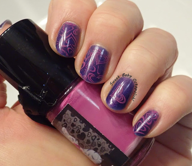
Masura The Red Square Nebula + DRK Nails Magnetic Topcoat

Image
Oh look!  A free weekend after a KRAYZEE work week and the hectic nail art-ing of last weekend's Oscars schindig?  Why yes we DO have time to play with magnets! indoor, bright CF lighting But wait, what's this?  Yes indeed, my right hand will be making a rare showing as the star of this post, so please forgive any wonky camera angles.  Side note: of any object I routinely use, the camera is the most clearly right-handed operation only.  I'd be super peeved to be a leftie, since I'm not aware of any lefty cameras (like there are scissors, for example).  Anyway, for whatever reason, the magnetic lines softened a whole lot on my usual swatching left hand, like so: outdoor, bright sunlight While that looks very much like the softly glowy swatch photos Masura usually publishes for their magnetics, it's not what I was going for and not at all the best showing for the lovely The Red Square Nebula. outdoor, bright sunlight The Red Square Nebula is (somew

Valentine's Day in purple & pink

Image
Wow, Valentine's Day snuck up on me this year... I guess I was too busy with movies to ponder hearts & flowers? indoor, bright CF lighting I didn't want to do traditional red & pink, but I was absolutely feeling like cutesy hearts instead of grown up roses. outdoor, direct sunlight I've started with 3 coats of Elevation Polish Mount Cangyan , a purple jelly base with a soft, subtle shimmer.  I feel that the shimmer is more prominent both in the bottle and on my original swatch of this color, so perhaps something has faded a little? outdoor, direct sunlight Many of Uber Chic's plates have large designs that will cover the whole nail alongside a detail image of the same design.  I absolutely love these combos either for using the single image as an accent nail here, or for double-stamping that single image in a contrast color over the bigger image.  This hearts combo is from UC 1-03 in the pinky-purple of Esmaltes da Kelly Maria. indoor, brig

Oscars 2020!

Image
~~~~AND IT'S MOVIE TIME!!~~~~ This year, the Academy gave us movie fiends only a short few weeks to catch the nominees before the big show, and of course I can't plan out a nail design without watching it, so I've done pretty much nothing but films recently.  As always, there were some snubs, some gems, some WTF moments, and I did my annual capture of Best Picture nominees in nail art. This is the pile of plates and a few representative stamping polishes that went into this look - I'm not listing where everything came from, because this post would be a novel! With only 9 nominees this year, one thumb was simply film itself.  I end up using this design a whole lot around this time of year!  And the nominees are: Starting with my two absolute faves, on this hand index to pinky (L to R) we have: Parasite:  face with a black bar over the eyes à la the movie's poster JoJo Rabbit:  our tender little bunny over the military black & red of wartime

Colors by Llarowe Hellcat

Image
A couple of weekends ago, I had a girls' afternoon out that involved pedis, resulting in  Color Club We'll Never Be Royals being on my toes as we speak.  Usually, I end up matching my hands to  my feet at least once a pedi color, and to that end reached into the vault... outdoor, direct sunlight Llarowe released Hellcat back in 2013, when she used to theme occasional polishes around fighter planes.  It's a multichrome along the lines of HITS Unconventional  and the above-mentioned Royals, one of my all time fave shifts, and I forgive a whole lot for that purple-wine-scarlet look. outdoor, direct sunlight Hellcat was quite thick the first time I wore it, and it's quite thick now.  That means it takes a mere 2 coats for total opacity, which was somewhat unheard of back in the day for a duochrome, but also means that chips and edgewear are gonna show up more quickly than ideal. outdoor, shady/overcast daylight In addition to the utterly fabulous color sh

Book Club Nails: Pym

Image
My two book clubs met one week apart, and both of the selected books had striking cover graphics that were the obvious choice for inspiration. Mat Johnson's 'Pym' is a complex and occasionally hilarious satire/social commentary/riff on Edgar Allen Poe's only novel that has a whole lot to say about race in America by transporting everyone to Antarctica.  I started with the blue i found closest to the icy Antarctic ocean on the cover, OPI I Believe in Manicures.  This was a less than ideal base because it's streaky AF on the first coat in the way where you're really not sure if it's going to be ok even by the time you're painting a 3rd, but then one thick layer of TC magically brings it all together.  Though 3 coats was more than I wanted to wait to dry, ultimately it wore great, and the end result is a nicely saturated robin's egg blue.  The ice-covered mountains of the cover are recreated with the geometric mountain design from CB-005, and

Ethereal Lacquer Grímnismál - Take 2 (aka, "but does it stamp?")

Image
After my plan to wear Ethereal Lacquer Grímnismál as a stamped mani didn't pan out last time, I dug through the PPU facebook group and found the post that inspired me in the first place.  A swatcher had shown crème polishes in a slew of colors, with Grímnismál painted over half of each nail to show how dramatic the difference was.  Cobalt blue seemed like a real winner, so... indoor, bright CF lighting On my ring finger, I'm wearing 3 coats of Grímnismál on its own - indeed, plenty opaque without the need for any undies.  On the rest of my nails, I've started with a deep cobalt blue and stamped using a basketweave chevron pattern from Uber Chic 1-01. outdoor, direct sunlight I wanted to pick a pattern with chunky sections instead of thin lines - since I'm relying on the shimmer to show the pattern, I think any delicately drawn designs just won't show up.  Before topcoat, this looked AMAZING, with the hazy grey base of Grímnismál drying just slightly m