Posts

Showing posts with the label gradient

Valentine's Day hearts: Tonic Rose + One Million Flowers

Image
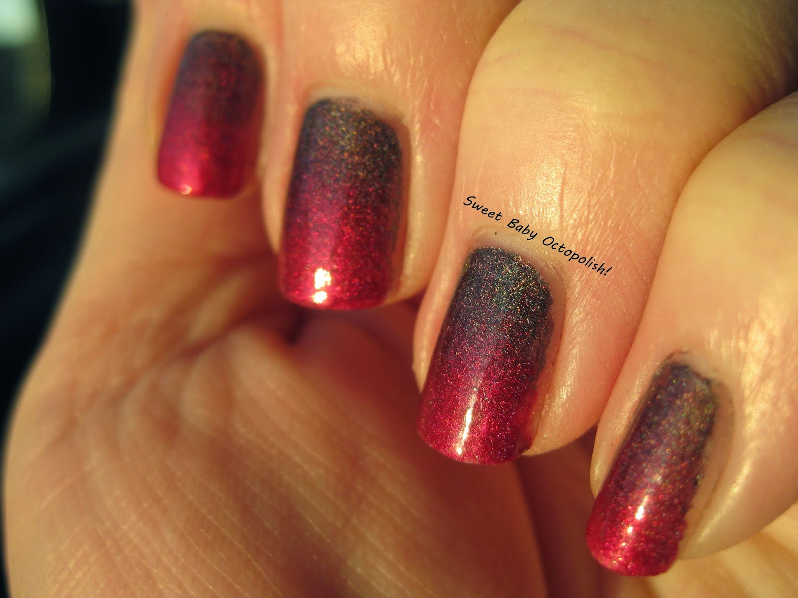
Well, one good Tonic deserves another, and I'm yet again inspired by The Polished Koi's amazing nail art looks. indirect, overcast daylight First, I started with a gradient base of Tonic Rose and One Million Flowers, with the design in reverse on my ring finger.  These two blended gorgeously, I think because the amount of holo and the metallic shifty shimmer overlay in both is so similar - each of these pretties have a rosy pink flash that shifts over to a warm coppery bronze. bright afternoon sunlight I'd initially planned on stamping with Rose to get a fading into the background look that only appeared on the paler One Million Flowers.  While Rose did stamp just fine (and would be gorgeous over a white, black, or deep purple crème base), the similarity in that shifty shimmer that made them blend so well also made the stamp blend too much into invisibility. outdoor, overcast daylight El Corazon Mysterious Mars to the rescue!  My fave multichrome stampi...

Don Deeva "Love Kills" Duo - Sid Vicious & Nancy

Image
"Unicorn Pee" (GAH how I hate that moniker.  but one must swim with the tide - note that my "230/FF" tag has been updated to include UP in there.  sigh.) is back in craze in a huge way with indie nail polish creators over the past few months.  I'm not alone in this being my fave sparkle pretty much ever, and even in a hoard that's kinda out of control, I just can't say no to this magic. indoor, bright CF lighting Don Deeva has been releasing a few Clarins 230/Fantasy Fire/Unicorn Pee polishes over the last year or so, then announced this pair in her fan group this month - a duo of jelly polishes with DOUBLE the typical amount of shifty shimmer in them.   Obviously , these got snapped up by yours truly ASAP. indoor, bright CF lighting The two have utterly identical formulas - both go on perfectly smooth, but need extra dry time in between coats due to their jelly nature - with Sid Vicious the more wine purple and Nancy the violet purple. i...

Crabs on the beach! Creating a gradient using a stamping plate.

Image
One of my best girls was having some friends over this weekend for a traditional Maryland crab fest, which just called for a fun summertime crabs on the beach mani. outdoor, bright sunlight I've seen more than a few versions of "beach" nails, but the color arrangement and design I went with were mostly inspired by this fantastic tutorial from Elleandish .  I've used Toma Shimmer Gold to Shell Pink (an old and now dead thermal I've had since college) for the sand color, OPI I Believe in Manicures for the middle blue, and a light turquoise crème for the tips.  Unlike the tutorial, though, I did most of this with stamping, which I found to be WAY easier than a traditionally created gradient. upper right of the picture = a rectangle for stamping gradients! Several stamping plates have been released lately that feature a big plain rectangle that happens to be a fantastic way to mix colors into a gradient.  This is ZJoy-04, a really inexpensive plate that...

Shleee-o-ween No 3: Black Moon

Image
My last Shleee Halloween-a-palooza suggested itself the moment I started playing around with the bottle.  Black Moon is a black jelly base with blue microglitters and silver holo flake, plus a duochromatic shimmer that flashes purple to green. indoor, bright CF lighting The black base and purple/green flash is just exactly the opposite of an old favorite, CrowsToes Season of the Witch.  The base of the CT is more sheer and the duochrome is a glassfleck instead of a regular shimmer, but the magic here is that it's exactly the opposite:  Black Moon is purple head-on and green at angles, while Witch is purple head-on and magenta at angles. outdoor, bright sunlight Season of the Witch was roughly sponged over the tips of 2 coats of Black Moon.  Straight on above, and slanted angle below, where the colors are reversed.  Duochrome-ception!! indoor, CF lighting Witch is a good bit more shifty and always appears either green or magenta, while in lower ...

Femme Fatale Deepstone + a England Prosperine Gradient

Image
For some reason, I'm on a crazy nail art kick lately, throwing all my hits and near-misses right on at you. Today's attempt is a gradient of Femme Fatale's Deepstone (the  2nd time this pretty is making an appearance in nail art , though I've still never worn it solo) and a England's Prosperine.  I both love the murky colors fading darker, and simultaneously think the gradient line is way too harsh of a stripe rather than a gradual blending. That bronze glimmer peeking out of Deepstone's wine base is fantastic, I really need to give that one a whirl on its own. Learning curve hot tip:  don't pick a pair of polishes with widely different opacities (Prosperine's one-coat and done vs Deepstone's need for 2), or else don't just lay the gradient down onto basecoat (i.e., definitely put a base layer of color down first). ~Michelle

Sinful Colors I Love You

Image
I needed a little summertime flash for my pedicure last week, and loved Sinful Colors I Love You enough that a matching mani was definitely in order. bright CF lighting Though the brightness of this light makes the polish look a little too sheer, it's definitely the most color-accurate of any pics I got - yep, the dreaded purple camera curse strikes again.  ILY is a rich purple jelly that tips over to the red/plum rather than the blue/royal purple side of things. indirect, overcast light It's got a lovely glassy shine even before topcoat, and is packed with a pretty, almost glassfleck sort of sparkle. indirect, overcast light The shimmer here is very subtly duochromatic, shifting from purple to bronze (which didn't change the overall appearance of the color). I brushed on a gradient of Sinful's Nail Junkie for accent nails - since both polishes are jellies, no sponge was needed.  I painted the nail tip in one color, then the base in the other, mak...

a England Sleeping Palace & Rose Bower Gradient

Image
Suzy recently posted an utterly flawless gradient of 2 of the new Elizabeth & Mary a England colors, so after texting her to get the technique sort of figured out, i gave it a go myself. outdoor late afternoon sunlight This is Sleeping Palace at the base and Rose Bower at the tips, both from a England's Burne-Jones Dream collection.  It's my first attempt at a gradient, and I almost took it off before finishing - after sponging on the colors, it was an uneven textured mess.  Top coat, however, returned it to the gloriously glowy finish I usually get from this brand. indoor CF lighting Rose Bower is one of my go-to fave reds, and Sleeping Palace is a fave of many a polish junkie... nuts that this is one of those untried-for-a-year things!! Yeah, more pics than a simple gradient needs, but I loved how this was a different look in different lights - the subtle scattered holo flash in bright light, and a deeper stone-to-fire feel in lower light. smolder...