Posts

Showing posts from October, 2014

Halloween Nails: Sinful Colors Black Magic

Image
Work is KRAY-ZEEEE lately, so I didn't have the time or energy for lavish holiday nails, but this time of year is always good for a special holiday polish that's neat on its own. Sinful Colors Black Magic was one of their Halloween releases last year, and I'm so glad I picked up a bottle then (it wasn't re-released this year).  It's a chunkier sort of glitter than I usually wear, but it's about perfect for Halloween:  very fine dark charcoal glitter, with medium-sized bright orange circles mixed in.  It's mostly opaque in 2 coats, but other swatches I've seen of one over black are also nice. Removal is as obnoxious as glitter usually is, so use a peel-off base coat if that's your thing. Rating 3 out of 5 stars.  Not my usual, but it's a fun holiday nail art in a bottle. Where to buy:  Sinful has repeated themselves at holiday collections before (e.g., the periodic reappearance of Green Ocean), so maybe next year?  Otherwise creep al

Lilypad Lacquer Wild at Heart + Sinful Colors All About You

Image
A recent sale/product launch/something over at Llarowe had me browsing my wishlist for a few items to make up that free shipping threshold, so my first Lilypad Lacquers, Wild at Heart, came along for the ride. indoor CF lighting If you know anything about me, you know I'm a permanent sucker for anything green...which is probably why i have about 9 bajillion green holos.  When I took this one out of the package, I chided my crazy self for purchasing something I'm sure I have near-dupes of, but when I put it on, nope.  Awesome. indoor, with flash Wild is a mossy, khaki green - a more earthy color than most of the emeralds and kellys I have in my stash.  The holo is linear and glorious, but what kills it is the rich golden flash that's so prominent it took me a while to decide firmly that it wasn't actually a duochrome. indoor, with flash.  swoon! The formula on this is pretty fantastic, too.  It's flawlessly self-leveling (you can't tell whi

Color Club The Uptown

Image
The Uptown was the clear stand-out from last fall's Girl About Town collection from Color Club.  Recently, though, the polish world has been all aflutter over the CC folks switching out the formula quietly like we wouldn't notice.  I wanted to get some swatches of this goodness up in case you're still able to find the original - snap it up quick! indoor CF lighting Much like my treasured  bottle of Nfu Oh 51 , Uptown is a lovely royal purple packed with color-shifting flakies.  The two are not dupes; Uptown has a little darker base and the flakes are larger and denser, but if you go look at those other pics, it's easy to see how similar they are. outdoor, direct sunlight The royal purple jelly base is just fantastic, and the rainbows are pretty damn incredible. indoor CF lighting 2 coats was lovely, but 3 was even richer and denser (as jellies do).  The shift was awesome, from emerald green to magenta fire. indoor, CF lighting outdoor, indirect

Pahlish El Topo Petit

Image
Pahlish consistently makes colors that end up totally unique in my stash... and yet, somehow, I have plenty of them that have been sitting around untried for a loooong time.  Here's one from last year's fall collection, El Topo Petit. indoor CF lighting El Topo Petit (the little mole) is a deep, earthy-grey crème with admixed metallic red shimmer.  There's definitely enough brown and plum tones to the base that it's "greige" or taupe, not at all a neutral concrete or elephant grey, so I think this is one that will look very different on people of different skin tones. indoor CF lighting The fiery shimmer is gorgeous when it's there, but in lower lighting, it can be shy.  This shade ends up a little darker when dry than in the bottle.  Like many of Pahlish's crèmes, it started off a bit thicker than ideal, and benefitted nicely from a little thinner.  3 coats here to even things out. indoor incandescent lighting Rating:  3 out of 5 sta

OPI Sprung

Image
Another brief vacation post... It's definitely fall, and I've definitely switched into the season's palette of colors.  I don't like the cold weather, but I so love the embers and dark colors of the cold part of the year! all pics are outdoor, late afternoon sunlight Despite being from a spring collection, Sprung is utterly fall in a bottle, with flashes of copper, orange, and gold.  The formula is lovely, opaque in 2 coats + a little touch up here and here (so, 2 and a half-ish). It's more of a foil finish than the glitter it looks like, so removal was pretty painless.  As a bonus, it has some of the pink and green shimmer that was so fantastic in a few of the Bond collection polishes - hard to catch on camera in this particular lighting, but trust me, it's there. Rating:  4 out of 5 stars.  This looked great with my skin, wore fantastically, and has a totally painless formula. Where to buy:  I don't know that this ended up as part of th

Butter London Prince's Plums

Image
I'm packed up for a nice vacation, so the next few posts will be pretty short & sweet.  Today I have one of Suzy's favorites (she talked me into its awesomeness despite my chemistry just not working with the other Butter London polishes I've tried), Prince's Plums. indirect sunlight PP is very tricky to photograph with any color accuracy, like plenty of other purples that shade toward blue.  The first coat shows much more of its red-plum base, but by the second, the blue/purple shimmer predominates.  It's a duochrome this way for some people, but the color was pretty consistent on my fingers. indoor incandescent lights And what lovely shimmer it is, aaaaaaaah. Rating:  3 out of 5 stars.  BLs still don't work great for me - this wears and chips inside of a day - but if your body chemistry loves their formula, it's a pretty damn nice color (i.e. my esteemed colleague calls this one a 5-star all the way). Where to buy:  Nordstrom's,

LynB Designs This is Halloween

Image
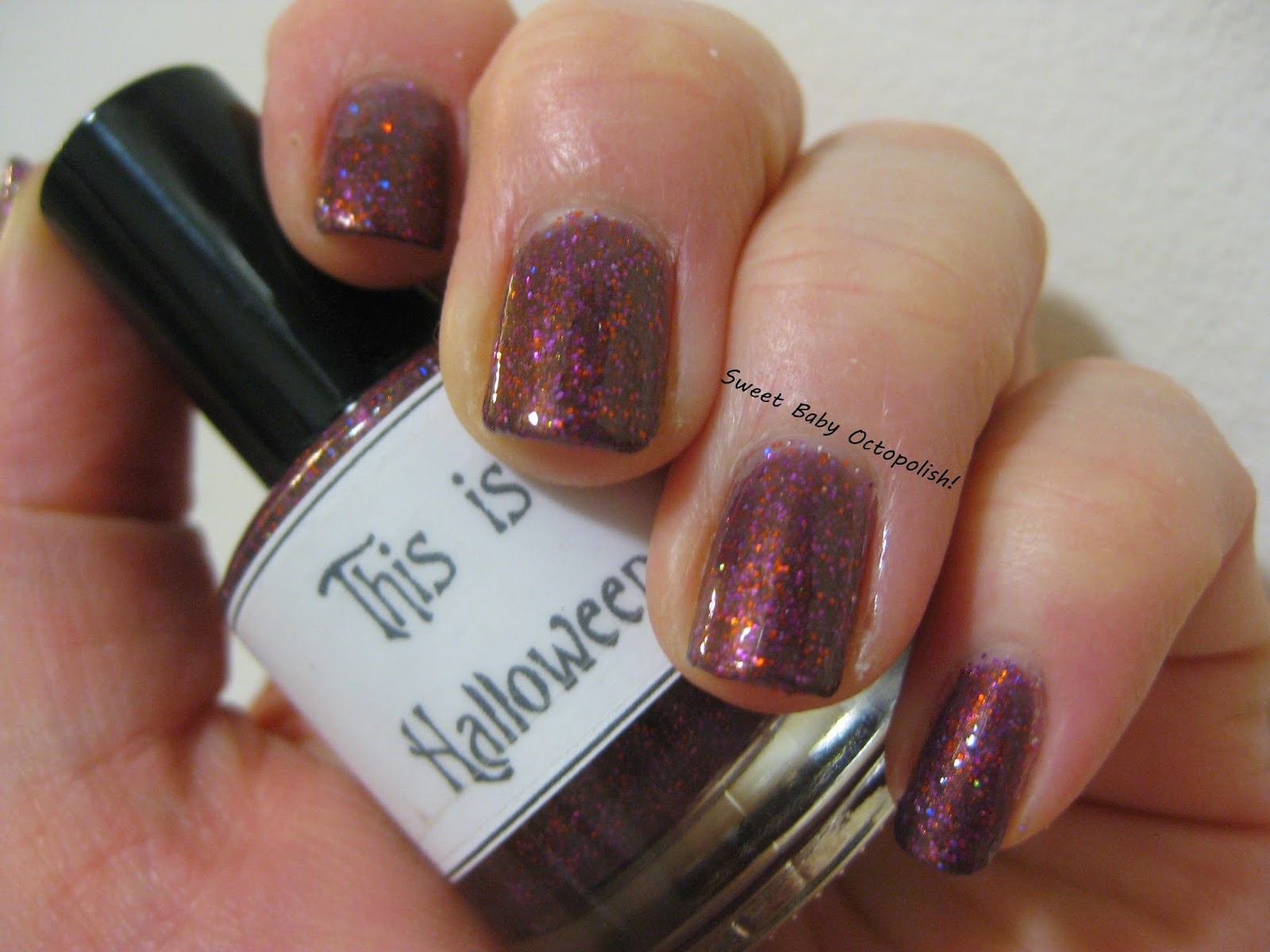
Most all of LynB's polishes are inspired by some sort of geeky fun.  This is Halloween is from the Nightmare Before Christmas collection, and is a really nice fall shade. indoor CF lighting TiH is a smoky plum jelly base that has glitter of a few different sorts suspended in it.  The jelly base means that if you wanted to give this a whirl as a topper, or wear it sheer if it compliments your skintone, it's totally an option at one coat: one coat, no cleanup.  indoor CF lighting The sparseness of those glitters at one coat was enough to have me concerned about how opaque I could get it, but it's perfectly solid in 3 coats.  With this much glitter, it does of course end up with a bit of texture, but one layer of top coat smooths things out fine. indoor, office fluorescents With 3 layers, the base becomes more smoke than purple, and the wine glitters emerge as the most dominant color.  There's a scattering of Halloween orange glitters thrown in, and even

Darling Diva Crazy Little Thing Called Love

Image
Last year's Queen collection (with all the polishes named for songs by the band) from Darling Diva was pretty fantastic, and I ended up snapping up most of them.  I've so far loved every one that I've tried, but it just so happens this is the first I've blogged of them. indoor, indirect sunlight All of the Queen polishes are duochromes that are also linear holos, so in the shade (above) you have a color shift, while in the sun/flash (below) you have a rainbow. indoor, flash Crazy Little Thing Called Love is a steely blue that shifts to silver and purple, and almost to copper.  It's generally pastel, but I'm sure that a darker version of these colors would happen when layered over black if that's your thing.  Shown here are 2 fully opaque coats on its own, undies are most definitely not needed. indoor, flash Most typically, I saw this saturated faded-denim shade of blue, with the really pretty flash of the same in the middle of the holo arc.

Pahlish Sink in the Silence, with bonus Pyrite

Image
It's getting chilly this year quicker than expected, and I always like the richer colors anyway, so I'm apparently slipping into fall/winter darks.  Sink in the Silence was from last year's winter collection - high time for me to give this one a try! indoor CF lighting Sink is a rich chocolate packed with gold microflakes.  As deeply saturated as this color is, it's never surprise black in any lighting.  The formula was great, and it was opaque in 2 coats.  In bright lighting and on closer inspection, the gold isn't there alone, but has some fiery red and bronze along for the ride: indoor CF lighting outdoor late afternoon sunlight Yup, definitely a autumn leaves sort of color, aaaaaah. indirect, shaded sunlight All that shimmer is packed in a jelly/crelly base, so this wore a little quicker than I'd like.  Since I wasn't ready for the sparkly chocolate to go away, I topped it with another of the winter collection,  Pyrite , leaving acc